After carefully identifying your contribution, it’s helpful to visualize it for your manuscript.
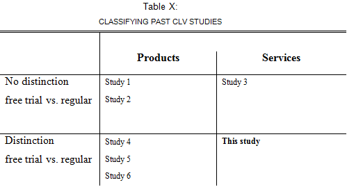
The classification matrix
One way in you can visualize your contrbiution is to classify your study along two dimensions. For example, in the figure below, This study is the only study that investigates Customer Lifetime Value (CLV) for services, while accounting for the difference between free trial and regular customers.
The “checkbox” table
An alternative way to visualize your contribution – especially when you have more than two distinguishing attributes – is to list it in a “checkbox” table. For example, below you see that This paper is the only one addressing all four marketing mix instruments (promotion, advertising, distribution, product), on two dependent variables (brand sales and elasticity), using an novel method (VPM-SE DLM) in many categories (25).
Obviously, the dimensions for your thesis will be different, so you will have to adjust column headings.
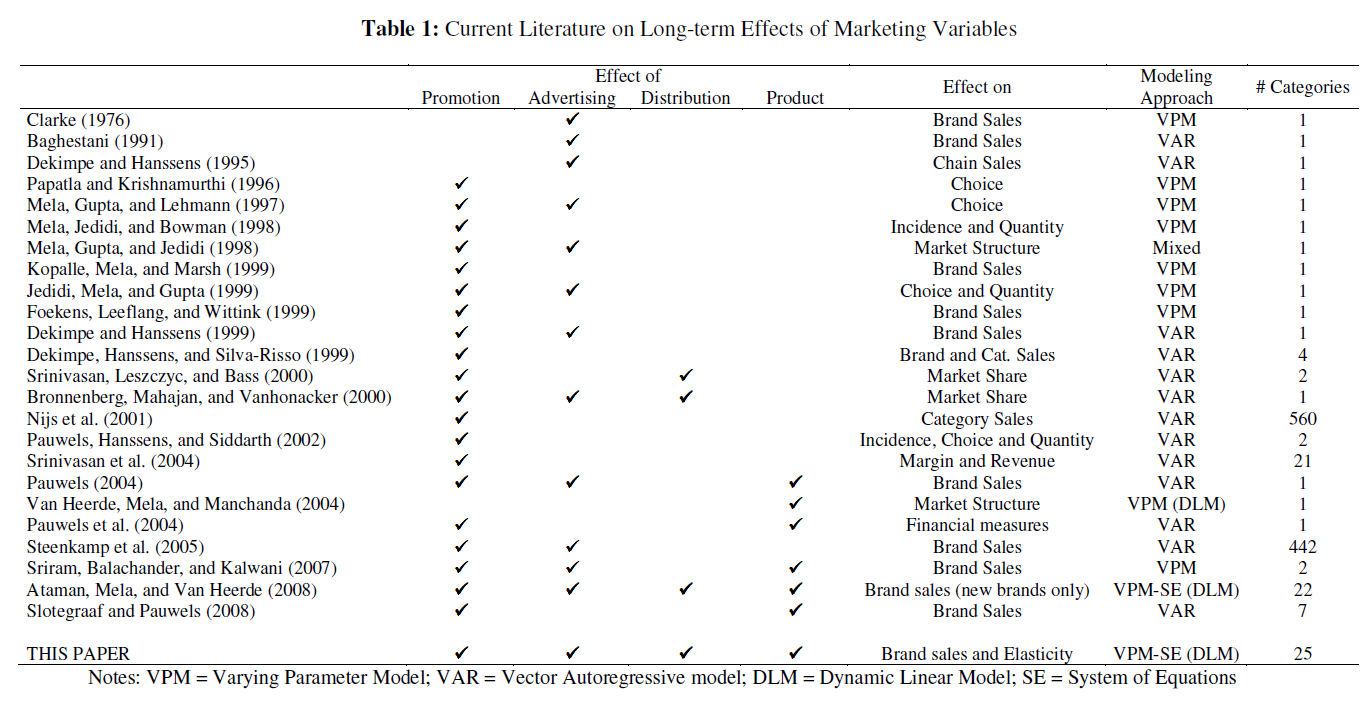
*Table based on Ataman, Berk, Harald J. van Heerde, Carl. F. Mela (2010), “The Long term Effect of Marketing Strategy on Brand Sales,” Journal of Marketing Research.